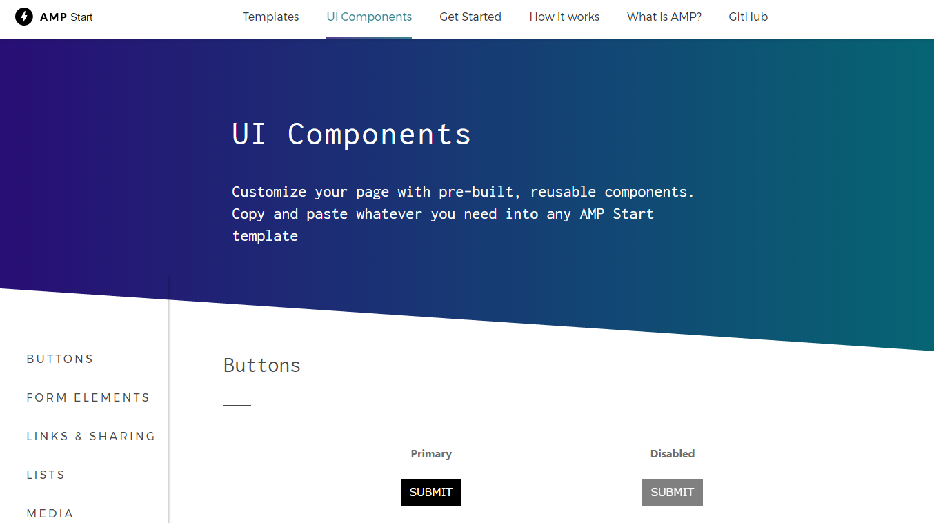
AMPプロジェクトからAMP対応のUIコンポーネントが公開されています。必要な要素をコピペで使うことができるので、開発リソースを大幅に節約することができます。
この記事では、ソーシャルアイコンのシェアボタンや画像のカルーセル機能、チェックボックスやラジオボタンのフォーム、レスポンシブ対応のナビゲーションメニューをAMP対応のHTMLコードで実装する方法を紹介します。
- ボタン
- フォーム要素 チェックボックス
- フォーム要素 ラジオボタン
- フォーム要素 テキストボックス
- フォーム要素 レンジ入力
- フォーム要素 テキストエリア
- フォーム要素 セレクトボックス
- 関連記事の表示1
- 関連記事の表示2
- ソーシャルアイコン フォローボタン
- ソーシャルアイコン シェアボタン
- リスト表示(番号付き)
- リスト表示(番号なし)
- 画像 フルページ表示
- 画像 ヘッドライン付き
- 画像 クレジットのキャプション付き
- 画像 カルーセル機能
- 画像 カルーセル機能キャプション付き
- 著者表示
- ナビゲーションメニュー(レスポンシブ対応)
- ナビゲーションメニュー(常にハンバーガーメニュー)
- フッター
- 見出し
- 文字サイズ
- 引用
- ドロップキャップ(先頭文字を大きく表示)
- 本文
ボタン
ボタンをAMP対応のHTMLで実装します。
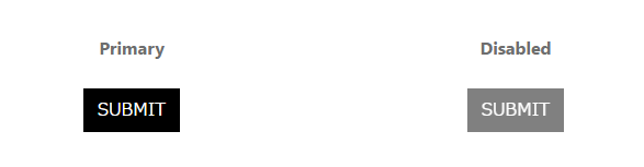
AMP対応HTMLコード
<button class="ampstart-btn">
  SUBMIT
</button>

<button class="ampstart-btn" disabled>
  SUBMIT
</button>
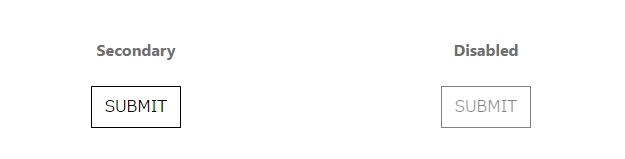
AMP対応HTMLコード
<button class="ampstart-btn ampstart-btn-secondary">
  SUBMIT
</button>

<button class="ampstart-btn ampstart-btn-secondary" disabled>
  SUBMIT
</button>
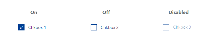
フォーム要素 チェックボックス
チェックボックスをAMP対応のHTMLで実装します。
AMP対応HTMLコード
<!-- Checkbox checked -->
<div class="ampstart-input ampstart-input-chk inline-block relative m0 p0 mb3 ">
    <input type="checkbox" value="1" name="cb" id="cb1" class="p0 m0 relative" checked="">
    <label for="cb1" class="">Chkbox 1</label>
</div>

<!-- Checkbox un-checked -->
<div class="ampstart-input ampstart-input-chk inline-block relative m0 p0 mb3 ">
    <input type="checkbox" value="2" name="cb" id="cb2" class="p0 m0 relative">
    <label for="cb2" class="">Chkbox 2</label>
</div>

<!-- Checkbox Disabled -->
<div class="ampstart-input ampstart-input-chk inline-block relative m0 p0 mb3 ">
    <input type="checkbox" value="3" name="cb" id="cb3" class="p0 m0 relative" disabled="">
    <label for="cb3" class="">Chkbox 3</label>
</div>
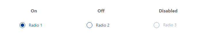
フォーム要素 ラジオボタン
ラジオボタンをAMP対応のHTMLで実装します。
AMP対応HTMLコード
<!--Checked Radio -->
<div class="ampstart-input ampstart-input-radio inline-block relative m0 p0 mb3 ">
  <input type="radio" value="1" name="rb" id="rb1" class="relative" checked>
  <label for="rb1" class="">Radio 1</label>
</div>

<!--Un-checked Radio -->
<div class="ampstart-input ampstart-input-radio inline-block relative m0 p0 mb3 ">
  <input type="radio" value="2" name="rb" id="rb2" class="relative">
  <label for="rb2" class="">Radio 2</label>
</div>

<!--Disabled Radio -->
<div class="ampstart-input ampstart-input-radio inline-block relative m0 p0 mb3 ">
  <input type="radio" value="3" name="rb" id="rb3" class="relative" disabled>
  <label for="rb3" class="">Radio 3</label>
</div>
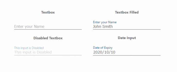
フォーム要素 テキストボックス
テキストボックスをAMP対応のHTMLで実装します。
AMP対応HTMLコード
<!-- Text Input -->
<div class="ampstart-input inline-block relative m0 p0 mb3 ">
  <input type="text" value="" name="name1" id="ip1" class="block border-none p0 m0" placeholder="Enter your Name">
  <label for="ip1" class="absolute top-0 right-0 bottom-0 left-0">
    Enter your Name
  </label>
</div>
<!-- End Input-->

<!-- Text Input with value -->
<div class="ampstart-input inline-block relative m0 p0 mb3 ">
  <input type="text" value="John Smith" name="name1" id="ip1" class="block border-none p0 m0" placeholder="Enter your Name">
  <label for="ip1" class="absolute top-0 right-0 bottom-0 left-0">Enter your Name</label>
</div>
<!-- End Input-->

<!-- Disabled text Input -->
<div class="ampstart-input inline-block relative m0 p0 mb3 ">
  <input type="text" value="" name="name1" id="ip1" class="block border-none p0 m0" placeholder="This input is Disabled" disabled="">
  <label for="ip1" class="absolute top-0 right-0 bottom-0 left-0">This input is Disabled</label>
</div>
<!-- End Input-->

<!-- Date Input -->
<div class="ampstart-input inline-block relative m0 p0 mb3 ">
  <input type="date" value="2020-10-10" name="name4" id="ip4" class="block border-none p0 m0" placeholder="Date of Expiry">
  <label for="ip4" class="absolute top-0 right-0 bottom-0 left-0">Date of Expiry</label>
</div>
<!-- End Input-->
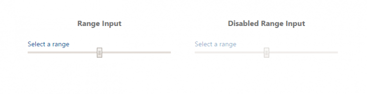
フォーム要素 レンジ入力
レンジ入力ををAMP対応のHTMLで実装します。
AMP対応HTMLコード
<!-- Range Input -->
<div class="ampstart-input inline-block relative m0 p0 mb3 ">
  <input type="range" value="" name="name11" id="ip11" class="block border-none p0 m0" placeholder="Select a range">
  <label for="ip11" class="absolute top-0 right-0 bottom-0 left-0">
    Select a range
  </label>
</div>
<!-- End Input-->

<!-- Disabled Range Input -->
<div class="ampstart-input inline-block relative m0 p0 mb3 ">
  <input type="range" value="" name="name11" id="ip11a" class="block border-none p0 m0" placeholder="Select a range" disabled>
  <label for="ip11a" class="absolute top-0 right-0 bottom-0 left-0">
    Select a range
  </label>
</div>
<!-- End Input-->
フォーム要素 テキストエリア
テキストエリアをAMP対応のHTMLで実装します。
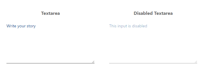
AMP対応HTMLコード
<!-- Textarea -->
<div class="ampstart-input inline-block relative m0 p0 mb3 ">
  <textarea name="name13" id="ip13" class="block border-none  p0 m0" rows="5"></textarea>
  <label for="ip13" class="absolute top-0 right-0 bottom-0 left-0">
    Write your story
  </label>
</div>
<!-- End Textarea -->

<!-- Disabled Textarea -->
<div class="ampstart-input inline-block relative m0 p0 mb3 ">
  <textarea name="name13" id="ip13a" class="block border-none  p0 m0" rows="5" disabled=""></textarea>
  <label for="ip13a" class="absolute top-0 right-0 bottom-0 left-0">
    This input is disabled
  </label>
</div>
<!-- End Textarea -->
フォーム要素 セレクトボックス
セレクトボックスをAMP対応のHTMLで実装します。
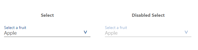
AMP対応HTMLコード
<!-- Select -->
<div class="ampstart-input inline-block relative m0 p0 mb3 ">
  <select name="name12" id="ip12" class="block border-none  p0 m0">
      <option value="">Apple</option>
      <option value="">Orange</option>
      <option value="">Lemon</option>
      <option value="">Grape</option>
  </select>
  <label for="ip12" class="absolute top-0 right-0 bottom-0 left-0">
    Select a fruit
  </label>
</div>
<!-- End Select -->

<!-- Disabled Select -->
<div class="ampstart-input inline-block relative m0 p0 mb3 ">
  <select name="name12" id="ip12a" class="block border-none  p0 m0" disabled="">
      <option value="">Apple</option>
      <option value="">Orange</option>
      <option value="">Lemon</option>
      <option value="">Grape</option>
  </select>
  <label for="ip12a" class="absolute top-0 right-0 bottom-0 left-0">
    Select a fruit
  </label>
</div>
<!-- End Select -->
関連記事の表示1
関連記事の表示をAMP対応のHTMLで実装します。
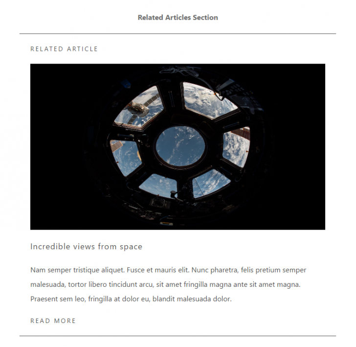
AMP対応HTMLコード
<section class="ampstart-related-article-section p3 mb4 border-top border-bottom">
  <h2 class="ampstart-heading h5 caps m0 mb3">Related article</h2>
  <article class="ampstart-related-article">
    <amp-img src="../../img/rectangle2.png" width="1280" height="720" layout="responsive" alt="" class="mb3"></amp-img>
    <h3 class="ampstart-heading h4 m0 mb3">Incredible views from space</h3>
    <p class="line-height-4 mb3">
        Nam semper tristique aliquet. Fusce et mauris elit. Nunc pharetra,
        felis pretium semper malesuada, tortor libero tincidunt arcu, sit
        amet fringilla magna ante sit amet magna. Praesent sem leo,
        fringilla at dolor eu, blandit malesuada dolor.
    </p>
    <a href="#" class="ampstart-rekated-article-readmore block text-decoration-none caps h5">
      Read more
    </a>
  </article>
</section>
関連記事の表示2
関連記事の表示をAMP対応のHTMLで実装します。
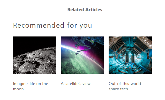
AMP対応HTMLコード
<section class="ampstart-related-section mb4 px3">
  <h2 class="h3 mb1">Recommended for you</h2>
  <ul class="ampstart-related-section-items list-reset flex flex-wrap m0">
    <li class="col-12 sm-col-4 md-col-4 lg-col-4 pr2 py2">

<!-- Start Image with Caption -->
      <figure class="ampstart-image-with-caption m0 relative mb4">
        <amp-img src="../../img/rectangle1.png" width="233" height="202" layout="responsive" class=""></amp-img>
        <figcaption class="h5 mt1 px3">
          Imagine: life on the moon
        </figcaption>
      </figure>

<!-- End Image with Caption -->
    </li>
    <li class="col-12 sm-col-4 md-col-4 lg-col-4 pr2 py2">

<!-- Start Image with Caption -->
      <figure class="ampstart-image-with-caption m0 relative mb4">
        <amp-img src="../../img/rectangle2.png" width="233" height="202" layout="responsive" class=""></amp-img>
        <figcaption class="h5 mt1 px3">
          A satellite's view
        </figcaption>
      </figure>

<!-- End Image with Caption -->
    </li>
    <li class="col-12 sm-col-4 md-col-4 lg-col-4 pr2 py2">

<!-- Start Image with Caption -->
      <figure class="ampstart-image-with-caption m0 relative mb4">
        <amp-img src="../../img/rectangle1.png" width="233" height="202" layout="responsive" class=""></amp-img>
        <figcaption class="h5 mt1 px3">
          Out-of-this-world space tech
        </figcaption>
      </figure>

<!-- End Image with Caption -->
    </li>
  </ul>
</section>
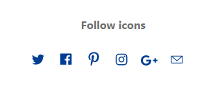
ソーシャルアイコン フォローボタン
Twitter、Facebook、Google+、Pinterest、メールのフォローボタンをAMP対応のHTMLで実装します。
AMP対応HTMLコード
<ul class="ampstart-social-follow list-reset flex justify-around items-center flex-wrap m0 mb4">
 <li class="mr2">
 <a href="#" class="inline-block">
 <svg xmlns="http://www.w3.org/2000/svg" width="24" height="22.2" viewbox="0 0 53 49">
 <title>Twitter</title>
 <path d="M45 6.9c-1.6 1-3.3 1.6-5.2 2-1.5-1.6-3.6-2.6-5.9-2.6-4.5 0-8.2 3.7-8.2 8.3 0 .6.1 1.3.2 1.9-6.8-.4-12.8-3.7-16.8-8.7C8.4 9 8 10.5 8 12c0 2.8 1.4 5.4 3.6 6.9-1.3-.1-2.6-.5-3.7-1.1v.1c0 4 2.8 7.4 6.6 8.1-.7.2-1.5.3-2.2.3-.5 0-1 0-1.5-.1 1 3.3 4 5.7 7.6 5.7-2.8 2.2-6.3 3.6-10.2 3.6-.6 0-1.3-.1-1.9-.1 3.6 2.3 7.9 3.7 12.5 3.7 15.1 0 23.3-12.6 23.3-23.6 0-.3 0-.7-.1-1 1.6-1.2 3-2.7 4.1-4.3-1.4.6-3 1.1-4.7 1.3 1.7-1 3-2.7 3.6-4.6" class="ampstart-icon ampstart-icon-twitter"></path>
 </svg>
 </a>
 </li>
 <li class="mr2">
 <a href="#" class="inline-block">
 <svg xmlns="http://www.w3.org/2000/svg" width="24" height="23.6" viewbox="0 0 56 55">
 <title>Facebook</title>
 <path d="M47.5 43c0 1.2-.9 2.1-2.1 2.1h-10V30h5.1l.8-5.9h-5.9v-3.7c0-1.7.5-2.9 3-2.9h3.1v-5.3c-.6 0-2.4-.2-4.6-.2-4.5 0-7.5 2.7-7.5 7.8v4.3h-5.1V30h5.1v15.1H10.7c-1.2 0-2.2-.9-2.2-2.1V8.3c0-1.2 1-2.2 2.2-2.2h34.7c1.2 0 2.1 1 2.1 2.2V43" class="ampstart-icon ampstart-icon-fb"></path>
 </svg>
 </a>
 </li>
 <li class="mr2">
 <a href="#" class="inline-block">
 <svg xmlns="http://www.w3.org/2000/svg" width="24" height="28.5" viewbox="0 0 43 51">
 <title>pinterest</title>
 <path d="M-13.6-5c0-1.6.2-3 .8-4.4.5-1.4 1.2-2.6 2.2-3.6.9-1 2-1.9 3.2-2.6 1.2-.8 2.5-1.3 3.9-1.7 1.5-.4 2.9-.5 4.4-.5 2.2 0 4.3.4 6.2 1.4 1.9.9 3.5 2.3 4.7 4.1 1.2 1.9 1.8 3.9 1.8 6.2 0 1.4-.1 2.7-.4 4C13-.8 12.5.5 12 1.7c-.6 1.2-1.3 2.3-2.2 3.2C9 5.8 8 6.6 6.7 7.1c-1.2.6-2.5.9-4 .9-1 0-1.9-.3-2.9-.7-.9-.5-1.6-1.1-2-1.9-.1.5-.3 1.4-.6 2.4-.3 1.1-.4 1.7-.5 2-.1.3-.2.9-.4 1.6-.3.7-.4 1.2-.6 1.5-.1.3-.4.7-.7 1.3-.3.6-.6 1.2-1 1.7-.3.5-.7 1.1-1.3 1.8l-.3.1-.2-.2c-.2-2.2-.3-3.6-.3-4 0-1.3.2-2.8.5-4.4.3-1.7.8-3.7 1.4-6.2.6-2.5 1-3.9 1.1-4.4-.5-.9-.7-2.1-.7-3.6 0-1.2.4-2.3 1.1-3.3.8-1.1 1.7-1.6 2.8-1.6.9 0 1.6.3 2.1.9.4.6.7 1.3.7 2.2 0 .9-.3 2.3-1 4.1C-.7-.9-1 .4-1 1.3c0 .9.3 1.6 1 2.2.6.6 1.4.9 2.3.9.8 0 1.5-.2 2.2-.5.6-.4 1.2-.9 1.6-1.5.5-.6.9-1.3 1.2-2 .4-.8.6-1.5.8-2.4.2-.8.4-1.6.5-2.4.1-.7.1-1.4.1-2.1 0-2.5-.8-4.4-2.3-5.8-1.6-1.4-3.6-2.1-6.1-2.1-2.8 0-5.2 1-7.1 2.8-1.9 1.9-2.9 4.2-2.9 7.1 0 .6.1 1.2.3 1.8.2.6.4 1.1.6 1.4.2.3.4.7.5 1 .2.3.3.5.3.6 0 .4-.1.9-.3 1.6-.2.6-.5 1-.8 1 0 0-.1-.1-.4-.1-.7-.2-1.3-.6-1.9-1.2-.5-.6-1-1.3-1.3-2-.3-.8-.5-1.6-.7-2.4-.2-.7-.2-1.5-.2-2.2z" transform="translate(21.734 23.748)" class="ampstart-icon ampstart-icon-pinterest"></path>
 </svg>
 </a>
 </li>
 <li class="mr2">
 <a href="#" class="inline-block">
 <svg xmlns="http://www.w3.org/2000/svg" width="24" height="24" viewbox="0 0 54 54">
 <title>instagram</title>
 <path d="M27.2 6.1c-5.1 0-5.8 0-7.8.1s-3.4.4-4.6.9c-1.2.5-2.3 1.1-3.3 2.2-1.1 1-1.7 2.1-2.2 3.3-.5 1.2-.8 2.6-.9 4.6-.1 2-.1 2.7-.1 7.8s0 5.8.1 7.8.4 3.4.9 4.6c.5 1.2 1.1 2.3 2.2 3.3 1 1.1 2.1 1.7 3.3 2.2 1.2.5 2.6.8 4.6.9 2 .1 2.7.1 7.8.1s5.8 0 7.8-.1 3.4-.4 4.6-.9c1.2-.5 2.3-1.1 3.3-2.2 1.1-1 1.7-2.1 2.2-3.3.5-1.2.8-2.6.9-4.6.1-2 .1-2.7.1-7.8s0-5.8-.1-7.8-.4-3.4-.9-4.6c-.5-1.2-1.1-2.3-2.2-3.3-1-1.1-2.1-1.7-3.3-2.2-1.2-.5-2.6-.8-4.6-.9-2-.1-2.7-.1-7.8-.1zm0 3.4c5 0 5.6 0 7.6.1 1.9.1 2.9.4 3.5.7.9.3 1.6.7 2.2 1.4.7.6 1.1 1.3 1.4 2.2.3.6.6 1.6.7 3.5.1 2 .1 2.6.1 7.6s0 5.6-.1 7.6c-.1 1.9-.4 2.9-.7 3.5-.3.9-.7 1.6-1.4 2.2-.7.7-1.3 1.1-2.2 1.4-.6.3-1.7.6-3.5.7-2 .1-2.6.1-7.6.1-5.1 0-5.7 0-7.7-.1-1.8-.1-2.9-.4-3.5-.7-.9-.3-1.5-.7-2.2-1.4-.7-.7-1.1-1.3-1.4-2.2-.3-.6-.6-1.7-.7-3.5 0-2-.1-2.6-.1-7.6 0-5.1.1-5.7.1-7.7.1-1.8.4-2.8.7-3.5.3-.9.7-1.5 1.4-2.2.7-.6 1.3-1.1 2.2-1.4.6-.3 1.6-.6 3.5-.7h7.7zm0 5.8c-5.4 0-9.7 4.3-9.7 9.7 0 5.4 4.3 9.7 9.7 9.7 5.4 0 9.7-4.3 9.7-9.7 0-5.4-4.3-9.7-9.7-9.7zm0 16c-3.5 0-6.3-2.8-6.3-6.3s2.8-6.3 6.3-6.3 6.3 2.8 6.3 6.3-2.8 6.3-6.3 6.3zm12.4-16.4c0 1.3-1.1 2.3-2.3 2.3-1.3 0-2.3-1-2.3-2.3 0-1.2 1-2.3 2.3-2.3 1.2 0 2.3 1.1 2.3 2.3z" class="ampstart-icon ampstart-icon-instagram"></path>
 </svg>
 </a>
 </li>
 <li class="mr2">
 <a href="#" class="inline-block">
 <svg xmlns="http://www.w3.org/2000/svg" width="24" height="15.5" viewbox="0 0 45 29">
 <title>Shape</title>
 <path d="M45 12.5h-4.1V8.4h-4.1v4.1h-4.1v4h4.1v4.1h4.1v-4.1H45v-4zm-30.7 0v4.9h8.1c-.3 2.1-2.4 6.1-8.1 6.1-4.8 0-8.8-4-8.8-9s4-9 8.8-9c2.8 0 4.7 1.2 5.7 2.2l3.9-3.8C21.4 1.6 18.2.2 14.3.2 6.4.2 0 6.6 0 14.5s6.4 14.3 14.3 14.3c8.3 0 13.8-5.8 13.8-14 0-.9-.1-1.6-.3-2.3H14.3z" class="ampstart-icon ampstart-icon-gplus"></path>
 </svg>
 </a>
 </li>
 <li class="mr2">
 <a href="#" class="inline-block">
 <svg xmlns="http://www.w3.org/2000/svg" width="24" height="18.4" viewbox="0 0 56 43">
 <title>email</title>
 <path d="M10.5 6.4C9.1 6.4 8 7.5 8 8.9v21.3c0 1.3 1.1 2.5 2.5 2.5h34.9c1.4 0 2.5-1.2 2.5-2.5V8.9c0-1.4-1.1-2.5-2.5-2.5H10.5zm2.1 2.5h30.7L27.9 22.3 12.6 8.9zm-2.1 1.4l16.6 14.6c.5.4 1.2.4 1.7 0l16.6-14.6v19.9H10.5V10.3z" class="ampstart-icon ampstart-icon-email"></path>
 </svg>
 </a>
 </li>
</ul>
ソーシャルアイコン シェアボタン
Twitter、Facebook、Google+、Pinterest、メールでのシェアボタンをAMP対応のHTMLで実装します。
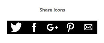
シェアボタンを実装するには、<head>タグ内にスクリプトタグを追加する必要があります。
<script custom-element="amp-social-share" src="https://cdn.ampproject.org/v0/amp-social-share-0.1.js" async></script>
AMP対応HTMLコード
<div class="ampstart-social-box mb4">
 <amp-social-share type="twitter"></amp-social-share>
 <amp-social-share type="facebook" data-param-text="Hello world" data-param-href="https://example.com/?ref=URL" data-param-app_id="145634995501895"></amp-social-share>
 <amp-social-share type="gplus"></amp-social-share>

 <amp-social-share type="pinterest"></amp-social-share>
 <amp-social-share type="email" data-param-subject="Hello World" data-param-body="What's up?"></amp-social-share>
</div>
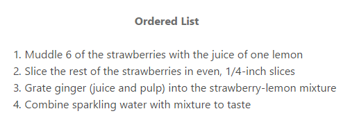
リスト表示(番号付き)
リスト表示(番号付き)をAMP対応のHTMLで実装します。
AMP対応HTMLコード
<ol class="m0">
  <li>Muddle 6 of the strawberries with the juice of one lemon</li>
  <li>Slice the rest of the strawberries in even, 1/4-inch slices</li>
  <li>Grate ginger (juice and pulp) into the strawberry-lemon mixture</li>
  <li>Combine sparkling water with mixture to taste</li>
</ol>
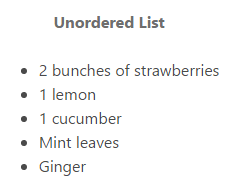
リスト表示(番号なし)
リスト表示(番号なし)をAMP対応のHTMLで実装します。
AMP対応HTMLコード
<ul class="m0">
  <li>2 bunches of strawberries</li>
  <li>1 lemon</li>
  <li>1 cucumber</li>
  <li>Mint leaves</li>
  <li>Ginger</li>
</ul>
画像 フルページ表示
画像のフルページ表示をAMP対応のHTMLで実装します。
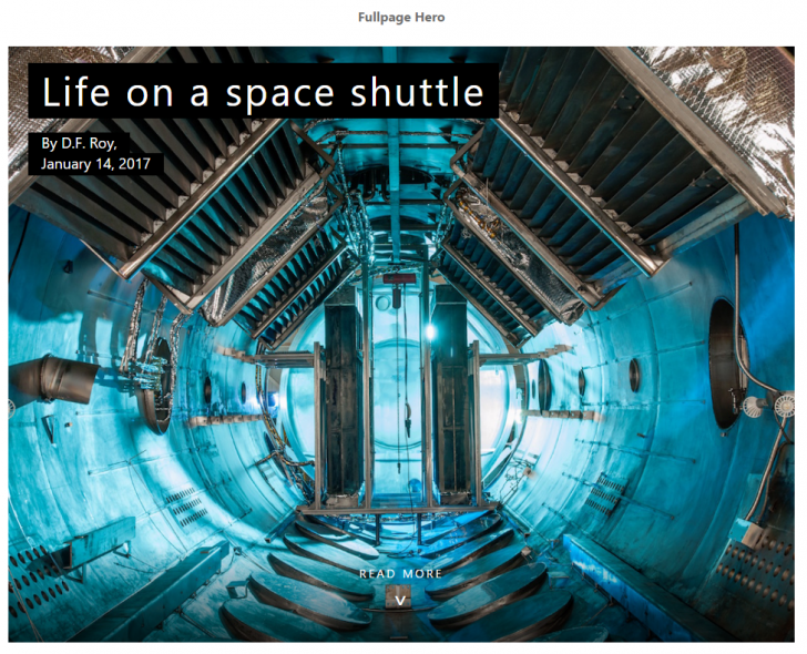
AMP対応HTMLコード
<figure class="ampstart-image-fullpage-hero m0 relative mb4">
  <amp-img width="404" height="720" layout="responsive" src="../../img/rectangle1.png" media="(max-width: 415px)"></amp-img>
  <amp-img height="720" layout="fixed-height" src="../../img/rectangle2.png" media="(min-width: 416px)"></amp-img>
  <figcaption class="absolute top-0 right-0 bottom-0 left-0">
    <header class="p3">
      <h1 class="ampstart-fullpage-hero-heading mb3">
        <span class="ampstart-fullpage-hero-heading-text">
          Life on a space shuttle
        </span>
      </h1>
      <span class="ampstart-image-credit h4">
        By <a href="#" role="author" class="text-decoration-none">D.F. Roy</a>,<br> January 14, 2017
      </span>
    </header>
    <footer class="absolute left-0 right-0 bottom-0">
        <a class="ampstart-readmore py3 caps line-height-2 text-decoration-none center block h5" href="#content">Read more</a>
    </footer>
  </figcaption>
</figure>
画像 ヘッドライン付き
ヘッドライン付きの画像をAMP対応のHTMLで実装します。
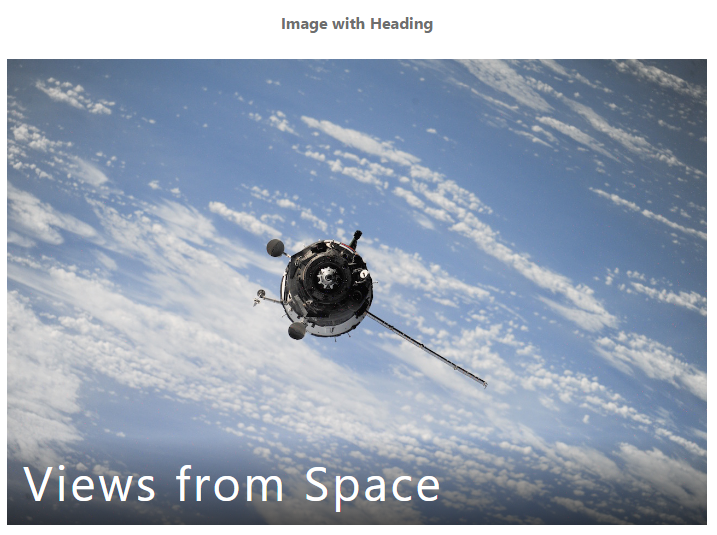
AMP対応HTMLコード
<figure class="ampstart-image-with-heading  m0 relative mb4">
  <amp-img src="../../img/rectangle2.png" width="1280" height="853" layout="responsive"></amp-img>
  <figcaption class="absolute right-0 bottom-0 left-0">
    <header class="ampstart-image-heading px2 py2 line-height-4">
      <h1>Views from Space</h1>
    </header>
  </figcaption>
</figure>
画像 クレジットのキャプション付き
クレジットのキャプション付きの画像をAMP対応のHTMLで実装します。
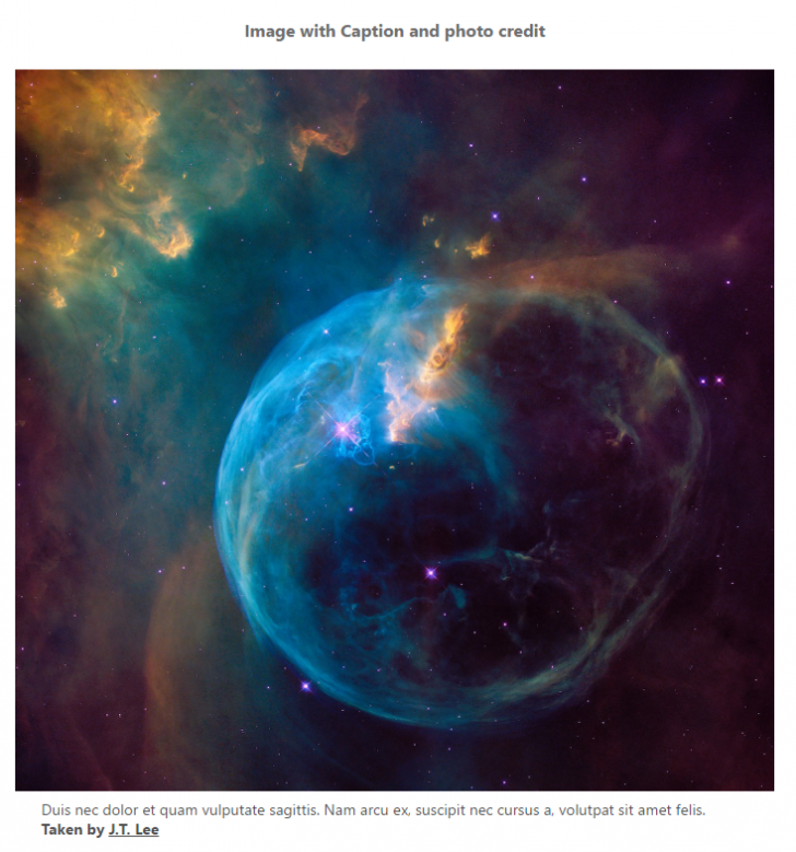
AMP対応HTMLコード
<figure class="ampstart-image-with-caption m0 relative mb4">
  <amp-img src="../../img/rectangle2.png" width="1280" height="853" layout="responsive" class=""></amp-img>
  <figcaption class="h5 mt1 px3">
    Duis nec dolor et quam vulputate sagittis. Nam arcu ex, suscipit nec cursus a, volutpat sit amet felis.
      <span class="ampstart-image-credit block bold">
        Taken by
          <a href="#" role="author">J.T. Lee</a>
      </span>
  </figcaption>
</figure>
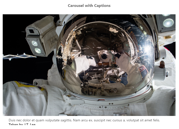
画像 カルーセル機能
画像カルーセル機能をAMP対応のHTMLで実装します。
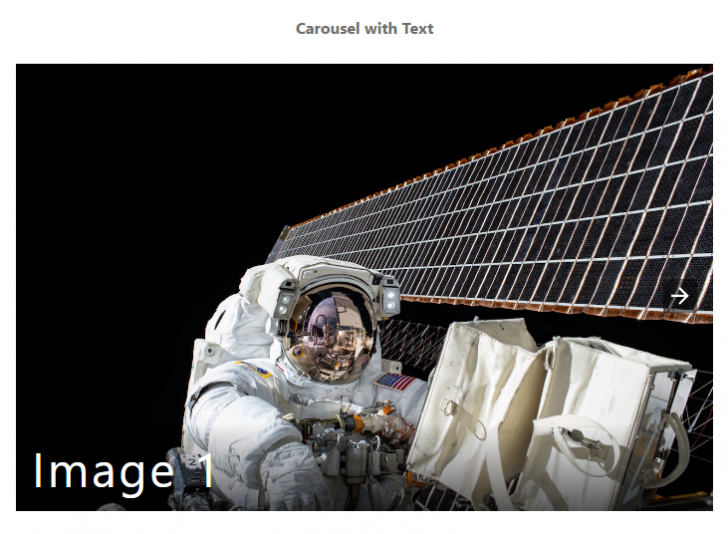
カルーセル機能を実装するには<head>タグ内にスクリプトを追加します。
<script custom-element="amp-carousel" src="https://cdn.ampproject.org/v0/amp-carousel-0.1.js" async></script>
AMP対応HTMLコード
<amp-carousel width="1280" height="853" layout="responsive" type="slides" class="mb4">


<!-- Start Image with heading -->
  <figure class="ampstart-image-with-heading  m0 relative mb4">
    <amp-img src="../../img/rectangle2.png" width="1280" height="853" layout="responsive"></amp-img>
    <figcaption class="absolute right-0 bottom-0 left-0">
      <header class="ampstart-image-heading px2 py2 line-height-4"><h1>Image 1</h1></header>
    </figcaption>
  </figure>

<!-- End Image with heading -->


<!-- Start Image with heading -->
  <figure class="ampstart-image-with-heading  m0 relative mb4">
    <amp-img src="../../img/rectangle1.png" width="1280" height="853" layout="responsive"></amp-img>
    <figcaption class="absolute right-0 bottom-0 left-0">
      <header class="ampstart-image-heading px2 py2 line-height-4"><h1>Image 2</h1></header>
    </figcaption>
  </figure>

<!-- End Image with heading -->


<!-- Start Image with heading -->
  <figure class="ampstart-image-with-heading  m0 relative mb4">
    <amp-img src="../../img/rectangle2.png" width="1280" height="853" layout="responsive"></amp-img>
    <figcaption class="absolute right-0 bottom-0 left-0">
      <header class="ampstart-image-heading px2 py2 line-height-4"><h1>Image 3</h1></header>
    </figcaption>
  </figure>

<!-- End Image with heading -->

</amp-carousel>
画像 カルーセル機能キャプション付き
キャプション付きの画像カルーセル機能をAMP対応のHTMLで実装します。
カルーセル機能を実装するには<head>タグ内にスクリプトを追加します。
<script custom-element="amp-carousel" src="https://cdn.ampproject.org/v0/amp-carousel-0.1.js" async></script>
AMP対応HTMLコード
<amp-carousel width="1280" height="853" layout="responsive" type="slides" class="mb4">

<!-- Start Image with Caption -->
  <figure class="ampstart-image-with-caption m0 relative mb4">
    <amp-img src="../../img/rectangle2.png" width="1280" height="753" layout="responsive" class=""></amp-img>
    <figcaption class="h5 mt1 px3">
      Duis nec dolor et quam vulputate sagittis. Nam arcu ex, suscipit nec cursus a, volutpat sit amet felis.
        <span class="ampstart-image-credit block bold">
          Taken by
            <a href="#" role="author">J.T. Lee</a>
        </span>
    </figcaption>
  </figure>

<!-- End Image with Caption -->


<!-- Start Image with Caption -->
  <figure class="ampstart-image-with-caption m0 relative mb4">
    <amp-img src="../../img/rectangle1.png" width="1280" height="753" layout="responsive" class=""></amp-img>
    <figcaption class="h5 mt1 px3">
      Duis nec dolor et quam vulputate sagittis. Nam arcu ex, suscipit nec cursus a, volutpat sit amet felis.
        <span class="ampstart-image-credit block bold">
          Taken by
            <a href="#" role="author">Mali D.</a>
        </span>
    </figcaption>
  </figure>

<!-- End Image with Caption -->


<!-- Start Image with Caption -->
  <figure class="ampstart-image-with-caption m0 relative mb4">
    <amp-img src="../../img/rectangle2.png" width="1280" height="753" layout="responsive" class=""></amp-img>
    <figcaption class="h5 mt1 px3">
      Duis nec dolor et quam vulputate sagittis. Nam arcu ex, suscipit nec cursus a, volutpat sit amet felis.
        <span class="ampstart-image-credit block bold">
          Taken by
            <a href="#" role="author">L. Fischer</a>
        </span>
    </figcaption>
  </figure>

<!-- End Image with Caption -->
</amp-carousel>
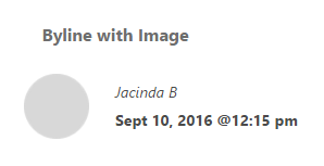
著者表示
著者表示をAMP対応のHTMLで実装します。
AMP対応HTMLコード
<address class="ampstart-byline clearfix mb4 px3 h5">
  <amp-img class="ampstart-byline-photo mr3 left" src="../../img/oval.png" layout="fixed" height="60" width="60"></amp-img>
  <a class="ampstart-byline-author block text-decoration-none my1" href="#" role="author">Jacinda B</a>
  <time class="ampstart-byline-pubdate block bold my1" datetime="2016-09-18T12:15">Sept 10, 2016 @12:15 pm</time>
</address>
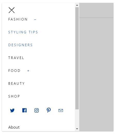
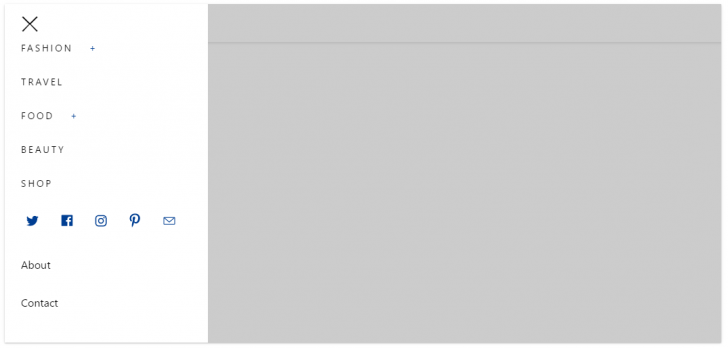
ナビゲーションメニュー(レスポンシブ対応)
レスポンシブ対応のナビゲーションメニューをAMP対応のHTMLで実装します。
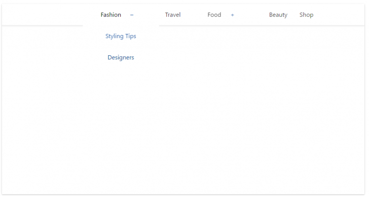
スマホ画面ではハンバーガーメニュー表示になります。
<head>タグ内にスクリプトを追加します。
<script custom-element="amp-sidebar" src="https://cdn.ampproject.org/v0/amp-sidebar-0.1.js" async></script>
<script custom-element="amp-accordion" src="https://cdn.ampproject.org/v0/amp-accordion-0.1.js" async></script>
AMP対応HTMLコード
<!-- Start Navbar -->
<header class="ampstart-headerbar fixed flex justify-start items-center top-0 left-0 right-0 pl2 pr4">
  <div role="button" on="tap:header-sidebar.toggle" tabindex="0" class="ampstart-navbar-trigger md-hide lg-hide pr2">☰</div>
  <amp-img src="../img/thescenic/header-logo.png" width="110" height="33" layout="fixed" class="my0 mx-auto " alt="The Blog"></amp-img>
  <nav class="ampstart-headerbar-nav ampstart-nav xs-hide sm-hide">
    <ul class="list-reset center m0 p0 flex justify-center nowrap">
      <li class="ampstart-nav-item ampstart-nav-dropdown relative">

<!-- Start Dropdown -->
        <amp-accordion layout="container" disable-session-states="" class="ampstart-dropdown absolute top-0 left-0 right-0 bottom-0">
        <section>
          <header>Fashion</header>
          <ul class="ampstart-dropdown-items list-reset m0 p0">
              <li class="ampstart-dropdown-item">
                <a href="#" class="text-decoration-none">Styling Tips</a>
              </li>
              <li class="ampstart-dropdown-item">
                <a href="#" class="text-decoration-none">Designers</a>
              </li>
          </ul>
        </section>
        </amp-accordion>

<!-- End Dropdown -->
      </li>
      <li class="ampstart-nav-item ">
        <a href="#" class="text-decoration-none block">Travel</a>
      </li>
      <li class="ampstart-nav-item ampstart-nav-dropdown relative">


<!-- Start Dropdown -->
        <amp-accordion layout="container" disable-session-states="" class="ampstart-dropdown absolute top-0 left-0 right-0 bottom-0">
        <section>
          <header>Food</header>
          <ul class="ampstart-dropdown-items list-reset m0 p0">
              <li class="ampstart-dropdown-item"><a href="#" class="text-decoration-none">Recipes</a></li>
              <li class="ampstart-dropdown-item"><a href="#" class="text-decoration-none">Hosting Tips</a></li>
          </ul>
        </section>
        </amp-accordion>

<!-- End Dropdown -->
      </li>
      <li class="ampstart-nav-item ">
        <a href="#" class="text-decoration-none block">Beauty</a>
      </li>
      <li class="ampstart-nav-item ">
        <a href="#" class="text-decoration-none block">Shop</a>
      </li>
    </ul>
  </nav>
</header>

<!-- Start Sidebar -->
<amp-sidebar id="header-sidebar" class="ampstart-sidebar px3 md-hide lg-hide" layout="nodisplay">
  <div class="flex justify-start items-center ampstart-sidebar-header">
    <div role="button" on="tap:header-sidebar.toggle" tabindex="0" class="ampstart-navbar-trigger items-start">✕</div>
  </div>
  <nav class="ampstart-sidebar-nav ampstart-nav">
    <ul class="list-reset m0 p0 caps h5">
      <li class="ampstart-nav-item ampstart-nav-dropdown relative">


<!-- Start Dropdown-inline -->
        <amp-accordion layout="container" disable-session-states="" class="ampstart-dropdown">
          <section>
            <header>Fashion</header>
            <ul class="ampstart-dropdown-items list-reset m0 p0">
                <li class="ampstart-dropdown-item"><a href="#" class="text-decoration-none">Styling Tips</a></li>
                <li class="ampstart-dropdown-item"><a href="#" class="text-decoration-none">Designers</a></li>
            </ul>
          </section>
        </amp-accordion>

<!-- End Dropdown-inline -->
      </li>
      <li class="ampstart-nav-item"><a href="#">Travel</a></li>
      <li class="ampstart-nav-item ampstart-nav-dropdown relative">


<!-- Start Dropdown-inline -->
        <amp-accordion layout="container" disable-session-states="" class="ampstart-dropdown">
          <section>
            <header>Food</header>
            <ul class="ampstart-dropdown-items list-reset m0 p0">
                <li class="ampstart-dropdown-item"><a href="#" class="text-decoration-none">Recipes</a></li>
                <li class="ampstart-dropdown-item"><a href="#" class="text-decoration-none">Hosting Tips</a></li>
            </ul>
          </section>
        </amp-accordion>

<!-- End Dropdown-inline -->
      </li>
      <li class="ampstart-nav-item"><a href="#">Beauty</a></li>
      <li class="ampstart-nav-item"><a href="#">Shop</a></li>
    </ul>
  </nav>

  <ul class="ampstart-social-follow list-reset flex justify-around items-center flex-wrap m0 mb4">
    <li class="mr2">
        <a href="#" class="inline-block"><svg xmlns="http://www.w3.org/2000/svg" width="24" height="22.2" viewbox="0 0 53 49"><title>Twitter</title><path d="M45 6.9c-1.6 1-3.3 1.6-5.2 2-1.5-1.6-3.6-2.6-5.9-2.6-4.5 0-8.2 3.7-8.2 8.3 0 .6.1 1.3.2 1.9-6.8-.4-12.8-3.7-16.8-8.7C8.4 9 8 10.5 8 12c0 2.8 1.4 5.4 3.6 6.9-1.3-.1-2.6-.5-3.7-1.1v.1c0 4 2.8 7.4 6.6 8.1-.7.2-1.5.3-2.2.3-.5 0-1 0-1.5-.1 1 3.3 4 5.7 7.6 5.7-2.8 2.2-6.3 3.6-10.2 3.6-.6 0-1.3-.1-1.9-.1 3.6 2.3 7.9 3.7 12.5 3.7 15.1 0 23.3-12.6 23.3-23.6 0-.3 0-.7-.1-1 1.6-1.2 3-2.7 4.1-4.3-1.4.6-3 1.1-4.7 1.3 1.7-1 3-2.7 3.6-4.6" class="ampstart-icon ampstart-icon-twitter"></path></svg></a>
    </li>
    <li class="mr2">
        <a href="#" class="inline-block"><svg xmlns="http://www.w3.org/2000/svg" width="24" height="23.6" viewbox="0 0 56 55"><title>Facebook</title><path d="M47.5 43c0 1.2-.9 2.1-2.1 2.1h-10V30h5.1l.8-5.9h-5.9v-3.7c0-1.7.5-2.9 3-2.9h3.1v-5.3c-.6 0-2.4-.2-4.6-.2-4.5 0-7.5 2.7-7.5 7.8v4.3h-5.1V30h5.1v15.1H10.7c-1.2 0-2.2-.9-2.2-2.1V8.3c0-1.2 1-2.2 2.2-2.2h34.7c1.2 0 2.1 1 2.1 2.2V43" class="ampstart-icon ampstart-icon-fb"></path></svg></a>
    </li>
    <li class="mr2">
        <a href="#" class="inline-block"><svg xmlns="http://www.w3.org/2000/svg" width="24" height="24" viewbox="0 0 54 54"><title>instagram</title><path d="M27.2 6.1c-5.1 0-5.8 0-7.8.1s-3.4.4-4.6.9c-1.2.5-2.3 1.1-3.3 2.2-1.1 1-1.7 2.1-2.2 3.3-.5 1.2-.8 2.6-.9 4.6-.1 2-.1 2.7-.1 7.8s0 5.8.1 7.8.4 3.4.9 4.6c.5 1.2 1.1 2.3 2.2 3.3 1 1.1 2.1 1.7 3.3 2.2 1.2.5 2.6.8 4.6.9 2 .1 2.7.1 7.8.1s5.8 0 7.8-.1 3.4-.4 4.6-.9c1.2-.5 2.3-1.1 3.3-2.2 1.1-1 1.7-2.1 2.2-3.3.5-1.2.8-2.6.9-4.6.1-2 .1-2.7.1-7.8s0-5.8-.1-7.8-.4-3.4-.9-4.6c-.5-1.2-1.1-2.3-2.2-3.3-1-1.1-2.1-1.7-3.3-2.2-1.2-.5-2.6-.8-4.6-.9-2-.1-2.7-.1-7.8-.1zm0 3.4c5 0 5.6 0 7.6.1 1.9.1 2.9.4 3.5.7.9.3 1.6.7 2.2 1.4.7.6 1.1 1.3 1.4 2.2.3.6.6 1.6.7 3.5.1 2 .1 2.6.1 7.6s0 5.6-.1 7.6c-.1 1.9-.4 2.9-.7 3.5-.3.9-.7 1.6-1.4 2.2-.7.7-1.3 1.1-2.2 1.4-.6.3-1.7.6-3.5.7-2 .1-2.6.1-7.6.1-5.1 0-5.7 0-7.7-.1-1.8-.1-2.9-.4-3.5-.7-.9-.3-1.5-.7-2.2-1.4-.7-.7-1.1-1.3-1.4-2.2-.3-.6-.6-1.7-.7-3.5 0-2-.1-2.6-.1-7.6 0-5.1.1-5.7.1-7.7.1-1.8.4-2.8.7-3.5.3-.9.7-1.5 1.4-2.2.7-.6 1.3-1.1 2.2-1.4.6-.3 1.6-.6 3.5-.7h7.7zm0 5.8c-5.4 0-9.7 4.3-9.7 9.7 0 5.4 4.3 9.7 9.7 9.7 5.4 0 9.7-4.3 9.7-9.7 0-5.4-4.3-9.7-9.7-9.7zm0 16c-3.5 0-6.3-2.8-6.3-6.3s2.8-6.3 6.3-6.3 6.3 2.8 6.3 6.3-2.8 6.3-6.3 6.3zm12.4-16.4c0 1.3-1.1 2.3-2.3 2.3-1.3 0-2.3-1-2.3-2.3 0-1.2 1-2.3 2.3-2.3 1.2 0 2.3 1.1 2.3 2.3z" class="ampstart-icon ampstart-icon-instagram"></path></svg></a>
    </li>
    <li class="mr2">
        <a href="#" class="inline-block"><svg xmlns="http://www.w3.org/2000/svg" width="24" height="28.5" viewbox="0 0 43 51"><title>pinterest</title><path d="M-13.6-5c0-1.6.2-3 .8-4.4.5-1.4 1.2-2.6 2.2-3.6.9-1 2-1.9 3.2-2.6 1.2-.8 2.5-1.3 3.9-1.7 1.5-.4 2.9-.5 4.4-.5 2.2 0 4.3.4 6.2 1.4 1.9.9 3.5 2.3 4.7 4.1 1.2 1.9 1.8 3.9 1.8 6.2 0 1.4-.1 2.7-.4 4C13-.8 12.5.5 12 1.7c-.6 1.2-1.3 2.3-2.2 3.2C9 5.8 8 6.6 6.7 7.1c-1.2.6-2.5.9-4 .9-1 0-1.9-.3-2.9-.7-.9-.5-1.6-1.1-2-1.9-.1.5-.3 1.4-.6 2.4-.3 1.1-.4 1.7-.5 2-.1.3-.2.9-.4 1.6-.3.7-.4 1.2-.6 1.5-.1.3-.4.7-.7 1.3-.3.6-.6 1.2-1 1.7-.3.5-.7 1.1-1.3 1.8l-.3.1-.2-.2c-.2-2.2-.3-3.6-.3-4 0-1.3.2-2.8.5-4.4.3-1.7.8-3.7 1.4-6.2.6-2.5 1-3.9 1.1-4.4-.5-.9-.7-2.1-.7-3.6 0-1.2.4-2.3 1.1-3.3.8-1.1 1.7-1.6 2.8-1.6.9 0 1.6.3 2.1.9.4.6.7 1.3.7 2.2 0 .9-.3 2.3-1 4.1C-.7-.9-1 .4-1 1.3c0 .9.3 1.6 1 2.2.6.6 1.4.9 2.3.9.8 0 1.5-.2 2.2-.5.6-.4 1.2-.9 1.6-1.5.5-.6.9-1.3 1.2-2 .4-.8.6-1.5.8-2.4.2-.8.4-1.6.5-2.4.1-.7.1-1.4.1-2.1 0-2.5-.8-4.4-2.3-5.8-1.6-1.4-3.6-2.1-6.1-2.1-2.8 0-5.2 1-7.1 2.8-1.9 1.9-2.9 4.2-2.9 7.1 0 .6.1 1.2.3 1.8.2.6.4 1.1.6 1.4.2.3.4.7.5 1 .2.3.3.5.3.6 0 .4-.1.9-.3 1.6-.2.6-.5 1-.8 1 0 0-.1-.1-.4-.1-.7-.2-1.3-.6-1.9-1.2-.5-.6-1-1.3-1.3-2-.3-.8-.5-1.6-.7-2.4-.2-.7-.2-1.5-.2-2.2z" transform="translate(21.734 23.748)" class="ampstart-icon ampstart-icon-pinterest"></path></svg></a>
    </li>
    <li class="mr2">
        <a href="#" class="inline-block"><svg xmlns="http://www.w3.org/2000/svg" width="24" height="18.4" viewbox="0 0 56 43"><title>email</title><path d="M10.5 6.4C9.1 6.4 8 7.5 8 8.9v21.3c0 1.3 1.1 2.5 2.5 2.5h34.9c1.4 0 2.5-1.2 2.5-2.5V8.9c0-1.4-1.1-2.5-2.5-2.5H10.5zm2.1 2.5h30.7L27.9 22.3 12.6 8.9zm-2.1 1.4l16.6 14.6c.5.4 1.2.4 1.7 0l16.6-14.6v19.9H10.5V10.3z" class="ampstart-icon ampstart-icon-email"></path></svg></a>
    </li>
  </ul>

  <ul class="ampstart-sidebar-faq list-reset m0">
    <li class="ampstart-faq-item">
      <a href="#" class="text-decoration-none">About</a>
    </li>
    <li class="ampstart-faq-item">
      <a href="#" class="text-decoration-none">Contact</a>
    </li>
  </ul>

</amp-sidebar>
<!-- End Sidebar -->
<!-- End Navbar -->
ナビゲーションメニュー(常にハンバーガーメニュー)
ハンバーガーメニューをAMP対応のHTMLで実装します。
<head>タグ内にスクリプトを追加します。
<script custom-element="amp-sidebar" src="https://cdn.ampproject.org/v0/amp-sidebar-0.1.js" async></script>
<script custom-element="amp-accordion" src="https://cdn.ampproject.org/v0/amp-accordion-0.1.js" async></script>
AMP対応HTMLコード
<!-- Start Navbar -->
<header class="ampstart-headerbar fixed flex justify-start items-center top-0 left-0 right-0 pl2 pr4">
    <div role="button" on="tap:header-sidebar.toggle" tabindex="0" class="ampstart-navbar-trigger  pr2">☰</div>
    <amp-img src="../img/thescenic/header-logo.png" width="110" height="33" layout="fixed" class="my0 mx-auto " alt="The Blog"></amp-img>
</header>

<!-- Start Sidebar -->
<amp-sidebar id="header-sidebar" class="ampstart-sidebar px3 " layout="nodisplay">
  <div class="flex justify-start items-center ampstart-sidebar-header">
    <div role="button" on="tap:header-sidebar.toggle" tabindex="0" class="ampstart-navbar-trigger items-start">✕</div>
  </div>

  <nav class="ampstart-sidebar-nav ampstart-nav">
    <ul class="list-reset m0 p0 caps h5">
      <li class="ampstart-nav-item ampstart-nav-dropdown relative">

<!-- Start Dropdown-inline -->
        <amp-accordion layout="container" disable-session-states="" class="ampstart-dropdown">
          <section>
            <header>Fashion</header>
            <ul class="ampstart-dropdown-items list-reset m0 p0">
                <li class="ampstart-dropdown-item"><a href="#" class="text-decoration-none">Styling Tips</a></li>
                <li class="ampstart-dropdown-item"><a href="#" class="text-decoration-none">Designers</a></li>
            </ul>
          </section>
        </amp-accordion>

<!-- End Dropdown-inline -->
      </li>
      <li class="ampstart-nav-item"><a href="#">Travel</a></li>
      <li class="ampstart-nav-item ampstart-nav-dropdown relative">

<!-- Start Dropdown-inline -->
        <amp-accordion layout="container" disable-session-states="" class="ampstart-dropdown">
          <section>
            <header>Food</header>
            <ul class="ampstart-dropdown-items list-reset m0 p0">
                <li class="ampstart-dropdown-item"><a href="#" class="text-decoration-none">Recipes</a></li>
                <li class="ampstart-dropdown-item"><a href="#" class="text-decoration-none">Hosting Tips</a></li>
            </ul>
          </section>
        </amp-accordion>

<!-- End Dropdown-inline -->
      </li>
      <li class="ampstart-nav-item"><a href="#">Beauty</a></li>
      <li class="ampstart-nav-item"><a href="#">Shop</a></li>
    </ul>
  </nav>

  <ul class="ampstart-social-follow list-reset flex justify-around items-center flex-wrap m0 mb4">
    <li class="mr2">
        <a href="#" class="inline-block"><svg xmlns="http://www.w3.org/2000/svg" width="24" height="22.2" viewbox="0 0 53 49"><title>Twitter</title><path d="M45 6.9c-1.6 1-3.3 1.6-5.2 2-1.5-1.6-3.6-2.6-5.9-2.6-4.5 0-8.2 3.7-8.2 8.3 0 .6.1 1.3.2 1.9-6.8-.4-12.8-3.7-16.8-8.7C8.4 9 8 10.5 8 12c0 2.8 1.4 5.4 3.6 6.9-1.3-.1-2.6-.5-3.7-1.1v.1c0 4 2.8 7.4 6.6 8.1-.7.2-1.5.3-2.2.3-.5 0-1 0-1.5-.1 1 3.3 4 5.7 7.6 5.7-2.8 2.2-6.3 3.6-10.2 3.6-.6 0-1.3-.1-1.9-.1 3.6 2.3 7.9 3.7 12.5 3.7 15.1 0 23.3-12.6 23.3-23.6 0-.3 0-.7-.1-1 1.6-1.2 3-2.7 4.1-4.3-1.4.6-3 1.1-4.7 1.3 1.7-1 3-2.7 3.6-4.6" class="ampstart-icon ampstart-icon-twitter"></path></svg></a>
    </li>
    <li class="mr2">
        <a href="#" class="inline-block"><svg xmlns="http://www.w3.org/2000/svg" width="24" height="23.6" viewbox="0 0 56 55"><title>Facebook</title><path d="M47.5 43c0 1.2-.9 2.1-2.1 2.1h-10V30h5.1l.8-5.9h-5.9v-3.7c0-1.7.5-2.9 3-2.9h3.1v-5.3c-.6 0-2.4-.2-4.6-.2-4.5 0-7.5 2.7-7.5 7.8v4.3h-5.1V30h5.1v15.1H10.7c-1.2 0-2.2-.9-2.2-2.1V8.3c0-1.2 1-2.2 2.2-2.2h34.7c1.2 0 2.1 1 2.1 2.2V43" class="ampstart-icon ampstart-icon-fb"></path></svg></a>
    </li>
    <li class="mr2">
        <a href="#" class="inline-block"><svg xmlns="http://www.w3.org/2000/svg" width="24" height="24" viewbox="0 0 54 54"><title>instagram</title><path d="M27.2 6.1c-5.1 0-5.8 0-7.8.1s-3.4.4-4.6.9c-1.2.5-2.3 1.1-3.3 2.2-1.1 1-1.7 2.1-2.2 3.3-.5 1.2-.8 2.6-.9 4.6-.1 2-.1 2.7-.1 7.8s0 5.8.1 7.8.4 3.4.9 4.6c.5 1.2 1.1 2.3 2.2 3.3 1 1.1 2.1 1.7 3.3 2.2 1.2.5 2.6.8 4.6.9 2 .1 2.7.1 7.8.1s5.8 0 7.8-.1 3.4-.4 4.6-.9c1.2-.5 2.3-1.1 3.3-2.2 1.1-1 1.7-2.1 2.2-3.3.5-1.2.8-2.6.9-4.6.1-2 .1-2.7.1-7.8s0-5.8-.1-7.8-.4-3.4-.9-4.6c-.5-1.2-1.1-2.3-2.2-3.3-1-1.1-2.1-1.7-3.3-2.2-1.2-.5-2.6-.8-4.6-.9-2-.1-2.7-.1-7.8-.1zm0 3.4c5 0 5.6 0 7.6.1 1.9.1 2.9.4 3.5.7.9.3 1.6.7 2.2 1.4.7.6 1.1 1.3 1.4 2.2.3.6.6 1.6.7 3.5.1 2 .1 2.6.1 7.6s0 5.6-.1 7.6c-.1 1.9-.4 2.9-.7 3.5-.3.9-.7 1.6-1.4 2.2-.7.7-1.3 1.1-2.2 1.4-.6.3-1.7.6-3.5.7-2 .1-2.6.1-7.6.1-5.1 0-5.7 0-7.7-.1-1.8-.1-2.9-.4-3.5-.7-.9-.3-1.5-.7-2.2-1.4-.7-.7-1.1-1.3-1.4-2.2-.3-.6-.6-1.7-.7-3.5 0-2-.1-2.6-.1-7.6 0-5.1.1-5.7.1-7.7.1-1.8.4-2.8.7-3.5.3-.9.7-1.5 1.4-2.2.7-.6 1.3-1.1 2.2-1.4.6-.3 1.6-.6 3.5-.7h7.7zm0 5.8c-5.4 0-9.7 4.3-9.7 9.7 0 5.4 4.3 9.7 9.7 9.7 5.4 0 9.7-4.3 9.7-9.7 0-5.4-4.3-9.7-9.7-9.7zm0 16c-3.5 0-6.3-2.8-6.3-6.3s2.8-6.3 6.3-6.3 6.3 2.8 6.3 6.3-2.8 6.3-6.3 6.3zm12.4-16.4c0 1.3-1.1 2.3-2.3 2.3-1.3 0-2.3-1-2.3-2.3 0-1.2 1-2.3 2.3-2.3 1.2 0 2.3 1.1 2.3 2.3z" class="ampstart-icon ampstart-icon-instagram"></path></svg></a>
    </li>
    <li class="mr2">
        <a href="#" class="inline-block"><svg xmlns="http://www.w3.org/2000/svg" width="24" height="28.5" viewbox="0 0 43 51"><title>pinterest</title><path d="M-13.6-5c0-1.6.2-3 .8-4.4.5-1.4 1.2-2.6 2.2-3.6.9-1 2-1.9 3.2-2.6 1.2-.8 2.5-1.3 3.9-1.7 1.5-.4 2.9-.5 4.4-.5 2.2 0 4.3.4 6.2 1.4 1.9.9 3.5 2.3 4.7 4.1 1.2 1.9 1.8 3.9 1.8 6.2 0 1.4-.1 2.7-.4 4C13-.8 12.5.5 12 1.7c-.6 1.2-1.3 2.3-2.2 3.2C9 5.8 8 6.6 6.7 7.1c-1.2.6-2.5.9-4 .9-1 0-1.9-.3-2.9-.7-.9-.5-1.6-1.1-2-1.9-.1.5-.3 1.4-.6 2.4-.3 1.1-.4 1.7-.5 2-.1.3-.2.9-.4 1.6-.3.7-.4 1.2-.6 1.5-.1.3-.4.7-.7 1.3-.3.6-.6 1.2-1 1.7-.3.5-.7 1.1-1.3 1.8l-.3.1-.2-.2c-.2-2.2-.3-3.6-.3-4 0-1.3.2-2.8.5-4.4.3-1.7.8-3.7 1.4-6.2.6-2.5 1-3.9 1.1-4.4-.5-.9-.7-2.1-.7-3.6 0-1.2.4-2.3 1.1-3.3.8-1.1 1.7-1.6 2.8-1.6.9 0 1.6.3 2.1.9.4.6.7 1.3.7 2.2 0 .9-.3 2.3-1 4.1C-.7-.9-1 .4-1 1.3c0 .9.3 1.6 1 2.2.6.6 1.4.9 2.3.9.8 0 1.5-.2 2.2-.5.6-.4 1.2-.9 1.6-1.5.5-.6.9-1.3 1.2-2 .4-.8.6-1.5.8-2.4.2-.8.4-1.6.5-2.4.1-.7.1-1.4.1-2.1 0-2.5-.8-4.4-2.3-5.8-1.6-1.4-3.6-2.1-6.1-2.1-2.8 0-5.2 1-7.1 2.8-1.9 1.9-2.9 4.2-2.9 7.1 0 .6.1 1.2.3 1.8.2.6.4 1.1.6 1.4.2.3.4.7.5 1 .2.3.3.5.3.6 0 .4-.1.9-.3 1.6-.2.6-.5 1-.8 1 0 0-.1-.1-.4-.1-.7-.2-1.3-.6-1.9-1.2-.5-.6-1-1.3-1.3-2-.3-.8-.5-1.6-.7-2.4-.2-.7-.2-1.5-.2-2.2z" transform="translate(21.734 23.748)" class="ampstart-icon ampstart-icon-pinterest"></path></svg></a>
    </li>
    <li class="mr2">
        <a href="#" class="inline-block"><svg xmlns="http://www.w3.org/2000/svg" width="24" height="18.4" viewbox="0 0 56 43"><title>email</title><path d="M10.5 6.4C9.1 6.4 8 7.5 8 8.9v21.3c0 1.3 1.1 2.5 2.5 2.5h34.9c1.4 0 2.5-1.2 2.5-2.5V8.9c0-1.4-1.1-2.5-2.5-2.5H10.5zm2.1 2.5h30.7L27.9 22.3 12.6 8.9zm-2.1 1.4l16.6 14.6c.5.4 1.2.4 1.7 0l16.6-14.6v19.9H10.5V10.3z" class="ampstart-icon ampstart-icon-email"></path></svg></a>
    </li>
  </ul>

  <ul class="ampstart-sidebar-faq list-reset m0">
    <li class="ampstart-faq-item">
      <a href="#" class="text-decoration-none">About</a>
    </li>
    <li class="ampstart-faq-item">
      <a href="#" class="text-decoration-none">Contact</a>
    </li>
  </ul>
</amp-sidebar>
<!-- End Sidebar -->
<!-- End Navbar -->
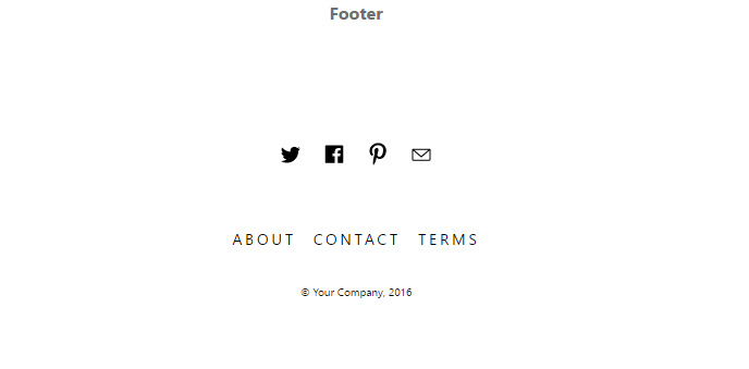
フッター
フッターをAMP対応のHTMLで実装します。
AMP対応HTMLコード
<footer class="ampstart-footer flex flex-column items-center p3">
  <ul class="ampstart-social-follow list-reset flex justify-around items-center flex-wrap m0 mb4">
    <li class="mr2">
      <a href="#" class="inline-block">
        <svg xmlns="http://www.w3.org/2000/svg" width="24" height="22.2" viewbox="0 0 53 49">
          <title>Twitter</title>
          <path d="M45 6.9c-1.6 1-3.3 1.6-5.2 2-1.5-1.6-3.6-2.6-5.9-2.6-4.5 0-8.2 3.7-8.2 8.3 0 .6.1 1.3.2 1.9-6.8-.4-12.8-3.7-16.8-8.7C8.4 9 8 10.5 8 12c0 2.8 1.4 5.4 3.6 6.9-1.3-.1-2.6-.5-3.7-1.1v.1c0 4 2.8 7.4 6.6 8.1-.7.2-1.5.3-2.2.3-.5 0-1 0-1.5-.1 1 3.3 4 5.7 7.6 5.7-2.8 2.2-6.3 3.6-10.2 3.6-.6 0-1.3-.1-1.9-.1 3.6 2.3 7.9 3.7 12.5 3.7 15.1 0 23.3-12.6 23.3-23.6 0-.3 0-.7-.1-1 1.6-1.2 3-2.7 4.1-4.3-1.4.6-3 1.1-4.7 1.3 1.7-1 3-2.7 3.6-4.6" class="ampstart-icon ampstart-icon-twitter"></path>
        </svg>
      </a>
    </li>
    <li class="mr2">
      <a href="#" class="inline-block">
        <svg xmlns="http://www.w3.org/2000/svg" width="24" height="23.6" viewbox="0 0 56 55">
          <title>Facebook</title>
          <path d="M47.5 43c0 1.2-.9 2.1-2.1 2.1h-10V30h5.1l.8-5.9h-5.9v-3.7c0-1.7.5-2.9 3-2.9h3.1v-5.3c-.6 0-2.4-.2-4.6-.2-4.5 0-7.5 2.7-7.5 7.8v4.3h-5.1V30h5.1v15.1H10.7c-1.2 0-2.2-.9-2.2-2.1V8.3c0-1.2 1-2.2 2.2-2.2h34.7c1.2 0 2.1 1 2.1 2.2V43" class="ampstart-icon ampstart-icon-fb"></path>
        </svg>
      </a>
    </li>
    <li class="mr2">
      <a href="#" class="inline-block">
        <svg xmlns="http://www.w3.org/2000/svg" width="24" height="28.5" viewbox="0 0 43 51">
          <title>pinterest</title>
          <path d="M-13.6-5c0-1.6.2-3 .8-4.4.5-1.4 1.2-2.6 2.2-3.6.9-1 2-1.9 3.2-2.6 1.2-.8 2.5-1.3 3.9-1.7 1.5-.4 2.9-.5 4.4-.5 2.2 0 4.3.4 6.2 1.4 1.9.9 3.5 2.3 4.7 4.1 1.2 1.9 1.8 3.9 1.8 6.2 0 1.4-.1 2.7-.4 4C13-.8 12.5.5 12 1.7c-.6 1.2-1.3 2.3-2.2 3.2C9 5.8 8 6.6 6.7 7.1c-1.2.6-2.5.9-4 .9-1 0-1.9-.3-2.9-.7-.9-.5-1.6-1.1-2-1.9-.1.5-.3 1.4-.6 2.4-.3 1.1-.4 1.7-.5 2-.1.3-.2.9-.4 1.6-.3.7-.4 1.2-.6 1.5-.1.3-.4.7-.7 1.3-.3.6-.6 1.2-1 1.7-.3.5-.7 1.1-1.3 1.8l-.3.1-.2-.2c-.2-2.2-.3-3.6-.3-4 0-1.3.2-2.8.5-4.4.3-1.7.8-3.7 1.4-6.2.6-2.5 1-3.9 1.1-4.4-.5-.9-.7-2.1-.7-3.6 0-1.2.4-2.3 1.1-3.3.8-1.1 1.7-1.6 2.8-1.6.9 0 1.6.3 2.1.9.4.6.7 1.3.7 2.2 0 .9-.3 2.3-1 4.1C-.7-.9-1 .4-1 1.3c0 .9.3 1.6 1 2.2.6.6 1.4.9 2.3.9.8 0 1.5-.2 2.2-.5.6-.4 1.2-.9 1.6-1.5.5-.6.9-1.3 1.2-2 .4-.8.6-1.5.8-2.4.2-.8.4-1.6.5-2.4.1-.7.1-1.4.1-2.1 0-2.5-.8-4.4-2.3-5.8-1.6-1.4-3.6-2.1-6.1-2.1-2.8 0-5.2 1-7.1 2.8-1.9 1.9-2.9 4.2-2.9 7.1 0 .6.1 1.2.3 1.8.2.6.4 1.1.6 1.4.2.3.4.7.5 1 .2.3.3.5.3.6 0 .4-.1.9-.3 1.6-.2.6-.5 1-.8 1 0 0-.1-.1-.4-.1-.7-.2-1.3-.6-1.9-1.2-.5-.6-1-1.3-1.3-2-.3-.8-.5-1.6-.7-2.4-.2-.7-.2-1.5-.2-2.2z" transform="translate(21.734 23.748)" class="ampstart-icon ampstart-icon-pinterest"></path>
        </svg>
      </a>
    </li>
    <li class="mr2">
      <a href="#" class="inline-block">
        <svg xmlns="http://www.w3.org/2000/svg" width="24" height="18.4" viewbox="0 0 56 43">
          <title>email</title>
          <path d="M10.5 6.4C9.1 6.4 8 7.5 8 8.9v21.3c0 1.3 1.1 2.5 2.5 2.5h34.9c1.4 0 2.5-1.2 2.5-2.5V8.9c0-1.4-1.1-2.5-2.5-2.5H10.5zm2.1 2.5h30.7L27.9 22.3 12.6 8.9zm-2.1 1.4l16.6 14.6c.5.4 1.2.4 1.7 0l16.6-14.6v19.9H10.5V10.3z" class="ampstart-icon ampstart-icon-email"></path>
        </svg>
      </a>
    </li>
</ul>
  <nav class="ampstart-footer-nav">
    <ul class="list-reset flex flex-wrap mb3">
      <li class="px1">
        <a class="text-decoration-none caps h5" href="#">About</a>
      </li>
      <li class="px1">
        <a class="text-decoration-none caps h5" href="#">Contact</a>
      </li>
      <li class="px1">
        <a class="text-decoration-none caps h5" href="#">Terms</a>
      </li>
    </ul>
  </nav>
  <small>© Your Company, 2016</small>
</footer>
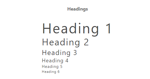
見出し
見出しをAMP対応のHTMLで実装します。
AMP対応HTMLコード
<h1>Heading 1</h1>
<h2>Heading 2</h2>
<h3>Heading 3</h3>
<h4>Heading 4</h4>
<h5>Heading 5</h5>
<h6>Heading 6</h6>
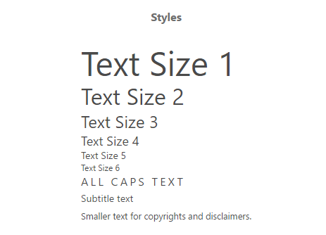
文字サイズ
文字サイズをAMP対応のHTMLで実装します。
AMP対応HTMLコード
<p class="h1">Text Size 1</p>
<p class="h2">Text Size 2</p>
<p class="h3">Text Size 3</p>
<p class="h4">Text Size 4</p>
<p class="h5">Text Size 5</p>
<p class="h6">Text Size 6</p>
<label class="caps">All caps text</label>
<div class="ampstart-subtitle">Subtitle text</div>
<small>Smaller text for copyrights and disclaimers.</small>
引用
引用をAMP対応のHTMLで実装します。
AMP対応HTMLコード
<blockquote class="ampstart-pullquote" cite="http://example.org">
  "Morbi vulputate purus sodales dapibus ultrices.
  Donec commodo condimentum enim, eget congue dui dapibus vel.
  Pellentesque porttitor sit amet justo eu scelerisque."
</blockquote>
ドロップキャップ(先頭文字を大きく表示)
先頭の文字を大きく表示するドロップキャプションをAMP対応のHTMLで実装します。
AMP対応HTMLコード
<p class="ampstart-dropcap">
  Donec porta orci eu tortor finibus, id facilisis metus aliquam.
  Pellentesque lobortis viverra odio ut eleifend.
  Integer elementum finibus magna, consequat fermentum dui ultrices sit amet.
</p>
本文
本文をAMP対応のHTMLで実装します。
AMP対応HTMLコード
<p class="mb4 px3">
  Sed leo sapien, molestie sit amet lorem eu, suscipit imperdiet tortor. Mauris
  maximus magna quam, non sodales metus auctor nec. Aenean tristique massa
  enim, non dictum mauris eleifend tristique. Proin fermentum nulla a nulla
  bibendum ultricies. Nulla pulvinar, risus vel tristique aliquet, elit quam
  tincidunt nisi, non blandit leo nulla eu ipsum. Sed porta, felis vitae
  elementum pellentesque, mauris felis rhoncus quam, ac suscipit eros justo ac
  justo. Proin et elit vitae sem interdum posuere et vitae nibh. Ut sed orci
  aliquam, pulvinar felis ac, pretium massa. Nullam porta ipsum non euismod
  mollis. Quisque scelerisque nisi quis pharetra blandit.
</p>
<p class="mb4 px3">
  Vestibulum eu varius dolor. Praesent sagittis magna sem, non bibendum quam
  aliquam et.Sed et tristique mi. Quisque porta lorem et nulla lacinia gravida.
  Nullam semper lobortis sem, interdum tempus tellus. Proin accumsan imperdiet
  leo at vulputate. Nulla euismod placerat finibus. Lorem ipsum dolor sit amet,
  consectetur adipiscing elit.
</p>